Saturday, December 24, 2016

Informatica ETL and Sql interview question :-

1)Write a query to display only friday dates from Jan, 2000 to till now?


SQL> SELECT SYSDATE,TO_CHAR(SYSDATE,'DY') FROM DUAL;

SYSDATE   TO_
--------- ---
24-DEC-16 SAT

SELECT C_DATE,TO_CHAR(C_DATE,'DY') FROM
 (
SELECT TO_DATE('01-JAN-2016','DD-MON-YYYY')+LEVEL-1 C_DATE FROM DUAL CONNECT BY LEVEL <=(SYSDATE - TO_DATE('01-JAN-2016','DD-MON-YYYY')+1)) WHERE TO_CHAR(C_DATE,'DY')='FRI';


2)EVERY day i am gettiing a file how to display jan 5th file in unix
ls -l  | grep 'yyyy-mm-dd'ls -l | grep --color=auto '2006-01-05'


You can sort it as follows:
ls -lu | grep --color=auto '2006-01-05'
List ALL *.c File Accessed 30 Days Ago


Type the following command

find /home/you -iname "*.c" -atime -30 -type -f


3)difference bet rownum and rowid


rowid has a physical significance i.e you can read a row if you know rowid. It is complete physical address of a row.
While rownum is temporary serial number allocated to each returned row during query execution.

ROWID is a unique pseudo number assigned to a row.
Rownum returns the number of rows for a resultant query. BOTH are pseudo columns not occupying any physical space in the database.

Example of Rownum:
Sort salary and return first 5 rows.
select * from
( select *
       from emp 
       order by sal desc ) 
where ROWNUM <= 5;

Example of Rowid:
Below query selects address of all rows that contain data for students in department 20
SELECT ROWID, last_name
       FROM student
       WHERE department_id = 20;

RowId represents a row in a table internally. It can be used for fast access to the row. Rownum is a function of the result set. 
select * from Student where rownum = 2 will get the first 2 rows of your result set.


INFORMATICA - Target Update Override : Updating Target
Table without any Primary Keys defined.
http://ramakantshankar.blogspot.in/2014/03/informatica-target-update-override.html
UDATE     
SET            = :TU.   
                   , [Other columns need to be updated]
WHERE      = :TU.
AND          [other conditions]

  • Example:

UPDATE    EMPL_POST_HIST
SET            POST = :TU.POST
                , UPDATE_DATE = :TU.UPDATE_DATE
WHERE EMPL = :TU.EMPL


4 ways to delete duplicate records Oracle


1. Using rowid
SQL > delete from emp
where rowid not in
(select max(rowid) from emp group by empno);
This technique can be applied to almost scenarios. Group by operation should be on the columns which identify the duplicates.
2. Using self-join
SQL > delete from emp e1
where rowid not in
(select max(rowid) from emp e2
where e1.empno = e2.empno );
3. Using row_number()
SQL > delete from emp where rowid in
(
select rid from
(
select rowid rid,
row_number() over(partition by empno order by empno) rn
from emp
)
where rn > 1
);
This is another efficient way to delete duplicates
4. Using dense_rank()
SQL > delete from emp where rowid in
(
select rid from
(
select rowid rid,
dense_rank() over(partition by empno order by rowid) rn
from emp
)
where rn > 1
);
Here you can use both rank() and dens_rank() since both will give unique records when order by rowid.

USING UNIX:-


$ sort file | uniq


$ sort -u file


What is an Inline View?INLINE VIEW

It is not a schema object like a normal view.
It is sub query with a name (alias) placed in the from clause of another select statement (main query) for which it (the sub query) acts as a data source.
The outer query will have a reference of the inline view.
The inline view can have a GROUP BY clause, order by clause or even inline view itself can be join.
Inline views are useful for performing the Top-N (Top 3 sales reps or top 10 students etc) analysis.
See AN EXAMPLE OF INLINE VIEW, WHICH HAS THE GROUP BY CLAUSE.  The query finds the employees in the emp table whose salary is less than the maximum salary of their department.

SQL> SELECT ENAME,SAL,E1.DEPTNO,E2.MAXSAL FROM EMP E1,
 (SELECT DEPTNO,MAX(SAL) MAXSAL FROM EMP GROUP BY DEPTNO)E2
 WHERE E1.DEPTNO=E2.DEPTNO AND E1.SAL
ENAME             SAL     DEPTNO     MAXSAL
---------- ---------- ---------- ----------
CLARK            2450         10       5000
MILLER          1300         10       5000
SMITH            800           20       3000
ADAMS           1100        20       3000
JONES            2975         20       3000
ALLEN            1600        30       2850
MARTIN         1250        30       2850
JAMES             950          30       2850
TURNER         1500         30       2850
WARD             1250         30       2850
10 rows selected.

SELECT ENAME,SAL,E1.DEPTNO,E2.MAXSAL FROM EMP E1,
 (SELECT DEPTNO,MAX(SAL) MAXSAL FROM EMP GROUP BY DEPTNO order by deptno)E2 WHERE E1.DEPTNO=E2.DEPTNO AND E1.SAL
ENAME             SAL     DEPTNO     MAXSAL
---------- ---------- ---------- ----------
CLARK            2450         10       5000
MILLER          1300         10       5000
SMITH            800           20       3000
ADAMS          1100         20       3000
JONES            2975         20       3000
ALLEN           1600         30       2850
MARTIN        1250         30       2850
JAMES           950            30       2850
TURNER       1500         30       2850
WARD           1250         30       2850

10 rows selected.


display max 3rd salary in oracle:-

select * from (select * from (select ename,sal from emp order by sal desc)
 where rownum < 4 order by sal)
 where rownum = 1;

SELECT name, salary FROM #Employee e1 WHERE 3-1 = (SELECT COUNT(DISTINCT salary) FROM #Employee e2 WHERE e2.salary > e1.salary);


Solution to finding the 2nd highest salary in SQL
 
 SELECT MAX(Salary) FROM Employee
WHERE Salary NOT IN (SELECT MAX(Salary) FROM Employee )


Tuesday, December 20, 2016

What is the exact difference between joiner and lookup transformation:-

What is the exact difference between joiner and lookup transformation:-

A joiner is used to join data from different sources and a lookup is used to get a related values from another table or check for updates etc in the target table. 

for lookup to work the table may not exist in the mapping but for a joiner to work, the table has to exist in the mapping.

A  lookup may be unconnected while a joiner may not

lookup may not participate in mapping
lookup does only non equi join

joiner table must paraticipate in mapping
joiner does only outer join


Joiner :
> It support equiv Join only.
> It may be we can perform outer join only.
> Joiner is used to source only.
> It may be only "=" operator used.
> In joiner may be not present in lookup override.
Lookup :
> It supports Equiv and non equiv join.
> Lookup used to source as well as target.
> It can not perform outer join in lookup.
> It may be = , < , > , <= . >= are used.

> It may be present in lookup override option.


Difference between Lookup and joiner transformation in Informatica


Look up transformation :
a) Look up transformation can be used on a single table or a query to search for records that match incoming records. Matching condition can be specified in the lookup transformation. The result returned can be multiple columns or single column.
b) Lookup transformation can be unconnected or connected transformation. Unconnected transformation can return only single value.
c) Lookup transformation can be static or active. Dynamic lookups are active transformation.
d) Lookup transformation be used with more than one relational operator such as > , =, etc.


Joiner transformation :

a) Joiner transformation is used to usually to join data coming from two separate tables or source qualifiers. 
b) The join can be left outer join, inner join, right outer join, etc.
c) The joiner returns all the results that match the join condition.
d) The master records in the joiner transformation is cached. The detail records are not cached. Hence, joiner transformation is active transformation.


When do you use joiner or lookup transformation?


a) If  the table size is not too large then preferable to use lookup.
b) If result from a single matching records needs to be returned then use a lookup. If there is a query that needs to be used in a lookup to find the result for lookup then good to use a lookup. 
c) If you are doing lookup on a table that is updated in the session then use a lookup. Joiners are active so not preferable.
d) If look up table data does not change then the table can be made persistent and used in the lookup which gives even better performance. 
e) If data from two different source qualifiers need to be joined then use a joiner.
f) If data from two different databases are read and need to be joined with a outer or inner join then use joiner transformation. 

Saturday, October 22, 2016

How different RPD deployment process in OBIEE 12c from 11c

RPD deployment process in OBIEE 12c

Windows;-

Step1:-

 Open the command prompt and type “cd \”to change the directory and press the Enter

Step2:-

Type “cd \Oracle_Home\user_projects\domains\bi\bitools\bin”and press 


Step 3:-
Run the data-model-cmd.cmd utility with the uploadrpd parameters:


Syntax:
uploadrpd -I .rpd -W -U -P -SI
Example:
uploadrpd -I BISAMPLE.rpd -W Admin123 -U weblogic -P weblogic123 -SI ssi
If the operation completes successfully, you will see the following message:
“Operation Successful. RPD upload completed successfully. ”
Notes:
uploadrpd
I specifies name of the repository.
W specifies the repository’s password.
U specifies a valid user’s name to be used for Oracle BI EE authentication.
P specifies the password corresponding to the user’s name that you specified for U.
SI specifies the name of the service instance.
Linux:-
In 12c you cannot simply FTP the current RPD down from the server and the enterprise manager no longer contains a deployment screen to put it back!
So firstly, where is the RPD file? Many directories in the OBIEE installation have changed in 12c and the RPD now is located in:
/user_projects/domains/bi/bidata/service_instances//metadata/datamodel/customizations

Note the – this is the instance name of your OBIEE install. Unless you’ve changed it, it’ll probably be ‘ssi’. Look in the /user_projects/domains/bi/bidata/service_instances directory to find it.
To download an RPD file for editing you need to use a new utility called data-model-cmd.sh (probably data-model-cmd.cmd on windows) which is located in the /user_projects/domains/bi/bitools/bin directory.
There are a number of parameters you need for this command, the minimum of which are:
/u01/app/obiee/user_projects/domains/bi/bitools/bin/data-model-cmd.sh downloadrpd -O obiee.rpd -SI ssi -U weblogic -P Password1

To upload the RPD we use the same data-model-cmd.sh command but with slightly different parameters:
/u01/app/obiee/user_projects/domains/bi/bitools/bin/data-model-cmd.sh uploadrpd -I obiee_new.rpd -SI ssi -U weblogic -P Password1

OBIEE12c_RPD_Files_6

How to start OBIEE 12c services Start and Stop Scripts here No More OPMN look at this...

How to start OBIEE 12c services Start and Stop Scripts here No More OPMN look at this...

In 11g, OPMN utility was used to manage System Components.
A system component is a manageable process that is not deployed in a Java application container. Oracle HTTP Server is an example of a system component. Now in 12c – OPMN is no longer used in Oracle Fusion Middleware. Instead, system components are managed by the WebLogic Management Framework

One of the things that is much improved about OBIEE 12c is the supplied control script for starting, stopping and monitoring all the components.  It works for the whole domain as well so you can start and stop components on another node without having to mess about logging into to every server.


Stopping OBIEE 12

[ORACLE_HOME]/user_projects/domains/bi12/bitools/bin

./stop.sh | stop.cmd {-i } {-r}
For example, ./stop.sh -i obis1,obips1 
-r (optional) Stops the remote Node Managers

If no instances are specified as arguments in the command, 
the administration server, managed server and all system components are shutdown by default.

Starting OBIEE 12


[ORACLE_HOME]/user_projects/domains/bi12/bitools/bin


./start.sh | start.cmd {-noprompt} {-i } {-r}

For example, ./start.sh -i obis1,obips1
If no instances are specified as arguments in the command, 
the administration server, managed server, all system components, and local node manager are started by default.

To view the status of Oracle Business Intelligence components in a domain using a command:
  1. Enter an appropriate command to run the status script located in:
    DOMAIN_HOME/bitools/bin
    On UNIX | Windows:
./status.sh | status.cmd {-v}

where {-v} is verbose

Status of OBIEE 12 Services (All Weblogic)


./status.sh | status.cmd {-v}

where {-v} is verbose

The command displays component name, type, status, and machine name.

  • BI Server (OBIS) — This component provides the query and data access capabilities at the heart of Oracle Business Intelligence and provides services for accessing and managing the enterprise semantic model (stored in a file with an .RPD extension).
  • BI Scheduler (OBISCH) — This component provides extensible scheduling for analyses to be delivered to users at specified times. (Oracle BI Publisher has its own scheduler.)
  • BI JavaHost (OBIJH) — This component provides component services that enable Oracle BI Presentation Services to support various components such as Java tasks for Oracle BI Scheduler, Oracle BI Publisher, and graph generation. It also enables Oracle BI Server query access to Hyperion Financial Management and Hyperion Planning data sources.
  • Essbase — This component provides support for Essbase.
  • BI Presentation Server (OPBIPS) — This component provides the framework and interface for the presentation of business intelligence data to web clients. It maintains an Oracle BI Presentation Catalog service on the file system for the customization of this presentation framework.
  • Cluster Controller (OBICCS) — This component distributes requests to the BI Server, ensuring requests are evenly load-balanced across all BI Server process instances in the BI domain.
To start and stop system component processes using Fusion Middleware Control:
Starting and Stopping System Component Processes

Description of Figure 2-1 follows


Friday, October 21, 2016

MIGRATION FROM OBIEE 11G TO OBIEE 12C (Linux and Windows)

MIGRATION FROM OBIEE 11G TO OBIEE 12C


Linux:-


Identify / Copy Migration Tool

In case your OBIEE 11g and OBIEE 12c installations are on same physical machine this step is obsolete and at this point you can only identify location of migration tool or eventually copy over to the shared folder location accessible by both: OBIEE 11g and 12c installations. Migration tool can be found in the sub-folders of OBIEE 12c installation:

{ORACLE_HOME_12C_FOLDER}/bi/migration-tool/jlib/bi-migration-tool.jar

If your OBIEE 11g installation exists on different physical server then you have to copy this file over to the OBIEE 11g machine.

Create Export Bundle from OBIEE 11g

Export bundle is generated with a help of bi-migration-tool.jar with the following command
java -jar {OBIEE11G_USER_HOME_FOLDER}/bi-migration-tool.jar OUT {ORACLE_HOME_11G_FOLDER}
{DOMAIN_HOME_11G_FOLDER} {EXPORT_FOLDER}/{export_file_name}.jar
# Export project from OBIEE 11g

java -jar /home/oraobiee/bi-migration-tool.jar out /u01/oracle/OBIEE/middleware/Oracle_BI1
 
/u01/oracle/OBIEE/middleware/user_projects/domains/prd_domain export_prd.jar

#export_prd.jar

Import Bundle to OBIEE 12c

With the the help of same tool: bi-migration-tool.jar we can now import our generated export bundle file to our OBIEE 12c domain. If there is already existing project for instance samples then it will get fully overwritten by imported OBIEE 11g bundle. Import command is similar to export and has the following syntax and parameters:

java -jar {ORACLE_HOME_12c}/bi/migration-tool/jlib/bi-migration-tool.jar IN {ORACLE_HOME_12c_FOLDER}

{DOMAIN_HOME_12c_FOLDER} {EXPORT_FOLDER}/{export_file_name}.jar {INSTANCE_NAME_12c}


New Features and Changes for Oracle BI EE 12c (12.2.1)

New Features and Changes for Oracle BI EE 12c (12.2.1)

Thursday, October 20, 2016

OBIEE 12C -Creating Analyses and Dashboards

    OBIEE12c 

    Creating Analyses and Dashboards

    Oracle BI is a comprehensive collection of enterprise business intelligence functionality that provides the full range of business intelligence capabilities, including dashboards, ad hoc analysis, proactive intelligence and alerts, and so on. Typically, organizations track and store large amounts of data about products, customers, prices, contacts, activities, assets, opportunities, employees, and other elements. This data is often spread across multiple databases in different locations with different versions of database software.
    After the data has been ordered and analyzed, it can provide an organization with the metrics to measure the state of its business. This data can also present key indicators of changes in market trends and in employee, customer, and partner behavior. Oracle BI helps you obtain, view, and analyze your data to achieve these goals.
    In this tutorial, you will learn how to create analyses, add graphs, work with pivot tables, format the analysis and graphs, create performance tiles and simple trellis charts, add column and view selectors, work with other views, and add external data from a spreadsheet. You will create a dashboard, and add user interactivity and dynamic content to the dashboard to enhance the user experience.

    Hardware and Software Requirements (Optional)

    The following is a list of software requirements:
    • Oracle BI EE 12c (12.2.1) or later must be installed
    • Windows 2000 or later must be installed
    • Access to Oracle Database 12c with pluggable database

    Prerequisites

    Before starting this tutorial, you should:
    • Have proper permissions to configure the dashboards.
    • Ensure that the Sample Sales repository is online. Click here to download the Sample Sales repository file, BISAMPLE.rpd. Save the rpd file and deploy it through the command line utility uploadrpd.
    • Have the data source spreadsheet XSA World Statistics.xlsx available on your machine. Click here to download the file.
    • To complete this tutorial you must have access to the BISAMPLE schema. that is included with the Sample Application for Oracle Business Intelligence Suite Enterprise Edition Plus. There are two options for accessing the BISAMPLE schema:
      a. If you already have the Sample Applications (V305) Virtual Box image installed from the OTN page , verify that you have access to the BISAMPLE schema and begin the tutorial. Some screenshots might differ.
      b. You can download a smaller BISAMPLE schema file (BISAMPLE.zip) from here. Unzip the BISAMPLE.zip file and import the schema to your database using Datapump Import instructions. At the end of the import you may get an error message. Ignore the message.
    • Ensure that the BISAMPLE.rpd is connected to the BISAMPLE schema.

Logging In

    This topic will cover the general navigation.
    To log into Oracle BI EE, perform the following steps:
  1. In a browser window, enter the url for analytics. In this example it is - http://localhost:9502/analytics.
  2. At the sign in page, enter your User ID and Password and click Sign In. Observe that you can select Accessibility Mode.
Sign In page

    When you sign in, the Home page is displayed. The Home page is a task-oriented, centralized workspace combined with a global header, allowing access to Oracle BI EE objects, their respective editors, help documentation, and so on.
    The Home Page contains a global header with drop-down menus for the most frequently performed tasks. The Create section provides short cut for creating objects such as Visual Analyzer projects, analyses, reports, and KPIs. The Jobs section provide information on currently running jobs. The Recent section displaying recently viewed or created analysis or dashboards, and the Most Popular section include frequently accessed items.
    Home page

    Searching the Catalog (Basic Search)

      This topic covers the basic search of catalog objects from the global header. Depending upon how your system is configured, you will use the basic search or the fully integrated full-text search to quickly find an object within the catalog.
      The basic Catalog search, which is the standard search delivered with Oracle BI EE, enables you to search for objects from the global header and the Home or Catalog pages. In the Catalog page, you can use the basic Catalog search to locate an object by searching for its exact name, description, location, and type, only. You find only those objects for which you have the appropriate permissions. When the desired object is located, you can select the object to display it for viewing or editing, as your permissions allow.
    1. In the global header's Search field, click the drop-down list, and select the object type for which you want to search. In the example, we search for Analysis.
    2. search analysis
    3. Place your cursor in the field next to the Search field and enter Revenue. When you search, you can enter part or all of the object's name or description.
    4. search Revenue
    5. Click the magnifying glass icon to begin the search.
    6. The Catalog page is displayed with the results that match your search criteria.
      Catalog page

      :)

        Creating an Analysis and Using the Analysis Editor

          This topic covers creating a new analysis by using the Analysis Editor.
        1. In the global header, click New, and select Analysis.
        2. New Analysis
          The Select Subject Area pop-up appears.
          A subject area contains columns that represent information about the areas of an organization's business or about groups of users within an organization. When you create a new analysis, this subject area is known as the primary subject area and will appear in the Subject Areas pane of the Analysis Editor. If, as you work, you need more data, you can add additional subject areas if you have permission to access these additional subject areas.
        3. In the Select Subject Area pop-up, select A - Sample Sales.
        4. A-Sample subject area
          The Analysis Editor is displayed.Analysis Editor
          The Analysis Editor is composed of tabs and panes, as shown in the screen shot, representing the subject area (columns), available catalog objects, selected columns for the analysis, and filters (which limit the selected data).
          A subject area contains folders, measure columns, attribute columns, hierarchical columns, and hierarchy levels that represent information about the areas of an organization's business or about groups of users with an organization. Subject areas usually have names that correspond to the types of information that they contain, such as Period, Regions, Products, Orders, and so on.
          In this example:
          • The selected subject area is A - Sample Sales
          • The four tabs - Criteria, Results, Prompts and Advanced are displayed at the top of the Editor
          • Selected columns pane is empty as you are yet to choose the columns
          • Filters is empty as well waiting for the column selections and further criteria
          There are various column types in a subject area. They are:
          Attribute ColumnIs similar to a column in a table in a relational data source. Holds a simple list of members, which function as attributes, similar to a dimension. Examples include Product ID or City.
          Hierarchy Column
          Is similar to a hierarchy of a dimension in a multidimensional data source. Holds a list in which individual members are shown in an outline manner, with lower-level members rolling into higher-level members, and outline totals being shown for the higher-level members. For example, a specific day belongs to a particular month, which in turn is within a particular year.
          Hierarchy columns can also be:
          Level-basedConsists of one or more levels. For example, a Time hierarchy might have levels for Year, Quarter, and Month.
          Value-basedConsists of values that define the hierarchy, rather than levels. For example, an Employee hierarchy might have no levels, but instead have names of employees who are managed by other employees. Employees can have titles, such as Vice President. Vice Presidents might report to other Vice Presidents and different Vice Presidents can be at different depths in the hierarchy.
          RaggedA hierarchy in which all the lower-level members do not have the same depth. For example, a Time hierarchy might have data for the current month at the day level, the previous month’s data at the month level, and the previous 5 years’ data at the quarter level. This is also known as an unbalanced hierarchy.
          Skip-levelA hierarchy in which certain members do not have values for certain higher levels. For example, in the United States, the city of Washington in the District of Columbia does not belong to a state. The expectation is that users can still navigate from the country level (United States) to Washington and below without the need for a state.
          Measure ColumnIs similar to a column of data in a table in a relational data source. Holds a simple list of data values. It is a column in an Oracle BI Enterprise Edition repository, usually in a fact table, that can change for each record and can be added up or aggregated in some way. Examples include Revenue or Units Sold.
          The screen shot shows folders and columns.
          Subject area contents
        5. To select columns, expand the folders and double click the required column names to get them in the Selected Columns section. Select the following columns for your analysis.
        6. Folder
          Columns
          Customers > Cust Regions
          C50 Region
          Products
          P1 Product
          Fact > Base Facts
          1 - Revenue
          The selected columns are displayed in the Selected Columns section. Your analysis criteria should look like this:
          Criteria
          Note: In the Selected Columns section, you can reorder the columns in your analysis by clicking and dragging them.
        7. Click the Results tab. The default Compound Layout is displayed.Results
          The Compound Layout is a composition of many views. By default, both a Title and Table view are defined for you when using attribute and measure columns. A Pivot Table view is automatically created when using hierarchical columns in your analysis.
          The Title view allows you to add a title (the default), a subtitle, a logo, a link to a custom online help page, and timestamps to the results. The Table view displays results in a standard table. You can navigate and drill down in the data. You can add totals, customize headings, and change the formula or aggregation rule for a column. You can also swap columns, control the appearance of a column and its contents, and specify formatting to apply only if the contents of the column meet certain conditions.
          Note: In the Compound Layout, you can create different views of the analysis results such as graphs, tickers, and pivot tables. These are covered in this tutorial going forward.
         

        Filtering, Sorting, and Saving Your Analysis

          This topic demonstrates how to filter, sort, and save the analysis you have created above.
          You will add a filter to the analysis and then save the filter. Filters allow you to limit the amount of data displayed in the analysis and are applied before the analysis is aggregated. Filters affect the analysis and thus the resulting values for measures. Filters can be applied directly to attribute columns and measure columns.
          A filter created and stored at the analysis level is called an inline filter because the filter is embedded in the analysis and is not stored as an object in the Presentation Catalog (Catalog). Therefore, an inline filter cannot be reused by other analysis or dashboards. If you save the filter however, it can be reused and is known as a named filter. (Named filters can also be created from the global header.)
          Perform the following steps to filter, sort and save the previously created analysis.
        1. Click the Criteria tab. In the Selected Columns area for C50 Region, click the More icon, and select Filter.
        2. Filter
        3. Accept the default value for the operator, that is is equal to / is in, and enter a column value (or a range of column values) for this condition. To do this, click the drop-down list for Value, and click the desired check boxes. Select Americas and EMEA.
        4. Filter
        5. Click OK. The Filters pane displays the newly created filter.Filters pane
        6. Save this filter. Click the More Options icon in the filters pane and select Save Filters.
        7. Save filters
          The Save As dialog box appears. A filter must be saved to a subject area folder so that it is available when you create an analysis using the same subject area.
        8. Navigate to the Subject Area Contents folder under the My Folders and select the A - Sample Salesfolder. Name the filter Americas and EMEA filterand accept the default location. If a Confirm Save Location dialog box appears, accept the default. Oracle BI EE allows you to save any type of business intelligence object to any location within the Catalog. However, for some object types such as filters, Oracle BI EE suggests the best Catalog location.
          The Save As dialog box should look like this:
          Save As
        9. Click OK.
        10. The Filters pane should look like this:
          Filter pane
          Next, you save the analysis so that you can verify the creation of your named filter within the Catalog.
        11. Click the Save icon to save your analysis. First you create a folder named Regional Revenue. In the Save As dialog box, navigate to My Folders and click theNew Folder icon .
        12. New folder
        13. In the Name field, enter Regional Revenue and click OK. Click Cancel to exit Save As dialog box.
        14. Name new folder
        15. Click the Save icon. Verify that the Regional Revenue folder is selected. In the Name text box, enter Regional Revenue and click OK.
        16. The analysis is saved to the catalog folder Regional Revenue.
        17. Click Home in the global navigation bar. In the Recent area, click the More link for the Regional Revenue analysis, and select Add to Favorites.
        18. Add to Favorites
          The analysis is added to the Favorites list and a Favorites icon displays next to the analysis name.
        19. Click the Edit ink for the Regional Revenue analysis.
        20. Home page
        21. To add a sort to this analysis, click the Criteria tab, click the More Options icon for 1- Revenue, and then select Sort > Sort Descending.
        22. Sort
          Observe that a sort icon is added to 1- Revenue. The order of the sort is indicated by an arrow; in this case, the arrows points down, indicating that it is descending. Additionally, if multiple sorts are added, a subscript number will also appear, indicating the sequence for the sort order.
          Sort descending
        23. Save your analysis again.
        24. Click the Results tab to verify the filter and sort are being applied to your analysis. The Compound Layout display the filtered and sorted analysis.
        25. Results
          This concludes the topic of saving an analysis and sorting it.
         

        Creating Selection Steps for Your Analysis

          This topic covers how to add selection steps to an analysis. Both filters and selection steps allow you to limit the data displayed in your analysis. Unlike filters that are applied before the analysis is aggregated, selection steps are applied after the analysis is aggregated. Selection steps only affect the members displayed, not the resulting aggregate values. For example, the outline total for the top level of a hierarchy is not affected if some members of the hierarchy are excluded from the selection. Selection steps are per column and cannot cross columns. While measure columns appear in the Selection Steps pane, you cannot create selection steps for them. Note that however, the grand totals and column totals are affected by selections. You can create selection steps for both attribute columns and hierarchical columns.
          You will add a selection step for products.
        1. In the Results tab of the Regional Revenue analysis, expand the Selection Steps pane of the Compound Layout.
        2. Results
          The Selection Steps pane opens.
          Selection Steps pane
        3. Under Products - P1 Product, hover over 1. Start with all members, and click the pencil icon.
        4. Selection steps
          The Edit Member Step dialog box appears with the list of available products.
          Edit members
          You will use the shuttle icons to move column members between the Available and the Selected columns.
          Move
        5. Click the Move All shuttle icon to move all members from Available to Selected pane.
        6. Edit members
        7. In the Selected column, select Install and Maintenance and click the Remove icon to return these two members to the Available column. You can use Ctrl-click to select multiple members in the list.
        8. Edit members
        9. Click OK.
        10. The Selection Steps pane appears with the new values added. Observe that you can also save the Selection Steps as an object in the Catalog by clicking the Save icon.
          Selection Step
        11. Click the Selection Steps pane again to minimize the Selection Steps pane
        12. Selection Step
        13. Verify your results by reviewing your analysis in the Table view of the Results tab. Install and Maintenance should not be list in the product list.
        14. Regional Revenue
         

        Adding Totals to Your Analysis

        1. Click the Edit View icon in the Table view.
        2. Regional Revenue
          The Table Editor appears.
          Table Editor
        3. To add a grand total to the analysis, click the Total icon to the right of Columns and Measures in the Layout pane of the Table editor. Select After from the drop-down list.
        4. Table Layout Editor
        5. Review the results in the Preview pane, and note that the Total icon in the Columns and Measures area now displays a green check mark, indicating that a grand total has been added to the analysis.
        6. Layout Editor
        7. Click Done.
        8. Before adding a total for Region, remove the sort from 1 - Revenue: Click the Criteria tab, click the More Options icon for 1- Revenue, and then select Sort > Clear Sort.
          Clear Sort
        9. Click the Results tab and review the Table view to confirm that the sort has been removed from the analysis.
        10. Results
          Now you will add a total by region to your analysis.
        11. Click the Edit View icon  
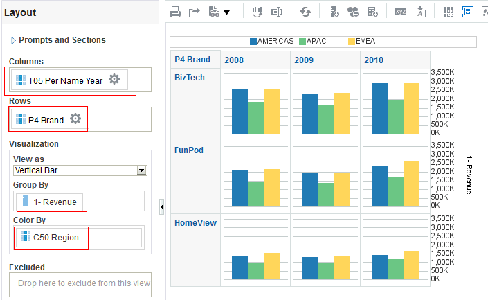
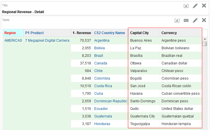
in the Table view. The Table Editor appears.
        12. In the Layout pane, click the Total icon for C50 Region, and select After.
        13. Total
        14. Review the results in the Preview pane, and note that the Total icon now displays a green check mark, indicating that a total has been added for that specific column/region.
        15. Total
          This concludes the section on adding totals to your analysis.
         

        Adding Formatting to Your Analysis


          After you create and run an analysis, default formatting rules are applied to the analysis' results. Default formatting rules are based on cascading style sheets and XML message files. You can create additional formatting to apply to specific results. Additional formats help you to highlight blocks of related information and call attention to specific data elements. You can also use additional formatting to customize the general appearance of analyses and dashboards.
          You will apply formatting to the C50 Region column.
        1. In the Layout pane, click the More options icon  for C50 Region and select Format Headings.
        2. Format Header
          The Edit Format dialog box appears.
          Edit Format
        3. In the Caption text box, enter Region.
        4. Caption box
        5. In the Font area, click the Color list, select a red color from the Color Selector dialog box, and click OK.
        6. Color Selector
        7. In the Cell area, click the Background Color list, select a light blue color from the Color Selector dialog box, and click OK.
        8. Color Selector
        9. Click OK in the Edit Format dialog box to see the results of your format changes for C50 Region.
        10. The Preview pane should look like this:
          Formatted Results
        11. Click the Table View Properties icon on the toolbar.
        12. Table View Properties
          The Table Properties dialog box appears.
        13. Select the Enable alternate styling check box, and click OK.
        14. Table Properties
        15. Click Done and then save your analysis.
        16. Save analysis

          Adding a Graph to an Analysis


            In this topic, you learn how to add a graph to an analysis, apply a saved filter, and format the graph.
             

            Enhancing an Analysis by Adding a Graph


              In this topic, you create a new analysis to which you add a graph, and then apply the named filter created in the first topic.
            1. Click New > Analysis on the global header. Use A - Sample Sales Subject Area.
            2. New Analysis
            3. Add C50 Region from Cust Regions, P1 Product from Products, and 1 - Revenue from Base Facts to Selected Columns.
            4. Criteria
              Next, you will add a named filter to limit the analysis to just Americas and EMEA data.
            5. In the Catalog pane, navigate to locate your filter named Americas and EMEA filter. Select the filter and click the Add More Options icon.
            6. Subject Area
            7. In the Apply Saved Filter dialog box, select the Apply contents of filter instead of a reference to the filter check box. This option adds the filter as an inline filter, allowing you to make changes without changing the Catalog filter item. Note that if you do not select this check box, the filter is added as a named filter that you can view, but not edit.
            8. Apply Save Filter
            9. Click OK. The filter is added to your analysis.
            10. Save Filter
            11. Save the analysis to your Regional Revenue folder, entering Regional Revenue Graph as the analysis name.
            12. Save Analysis
              You will add a graph to this analysis.
            13. Click the Results tab, then click the New View icon, and select Graph > Bar > Vertical from the menu.
            14. Add Graph
              The default Graph view appears below the Table view.
              Graph added
            15. Click the Remove View from Compound Layout icon for both Title and Table views.
            16. Remove Views
              Both views are removed from the Compound Layout. Note however, that they are still available for use from the Views pane.
              Graph View
            17. Save the analysis.
            18. Formatting the Graph


              1. Click the Edit View icon to begin your formatting changes. The Graph editor appears.
              2. Edit Graph View
                The Graph, like other view editors, is composed of three sections:
                Toolbar
                The toolbar allows you to change graph types and subtypes, print, preview, edit graph properties, and so on.
                Preview pane
                Preview Pane
                The preview pane is a dynamic view of the graph, allowing you to view the changes instantly.
                Layout
                Layout
                The layout allows you to change the properties of prompts, sections, measures, and so on, and allows you to regroup columns for graph display.
              3. Click the Edit graph properties icon.
              4. Graph View Properties
                The Graph properties dialog box appears. The Graph properties dialog box is composed of four tabs: General, Style, Scale, and Titles and Labels. These tabbed pages allow you to do the following:
                  GeneralSet properties related to the graph canvas, such as canvas width, height, legend location, and so on.
                  StyleSet properties that control the appearance of the graph such as plot area and grid lines.
                  ScaleSet properties for parts of the graph, that is axis limits and tick marks.
                  Titles and LabelsSet properties that control the display of titles and labels for the graph.
              5. Select Enable for Horizontal Axis from the Zoom and Scroll area, and then select Left from the Legend list. When zooming and scrolling is enabled for a graph, then the graph includes a Zoom icon. The Zoom icon allows you to zoom in and out of a graph's plot area via its axes. Once you zoom in on an axis, you can scroll the axis. When you zoom an axis, a zoom and scroll slider appears. The dialog box should look like this:
              6. Graph Properties
                Note: The "Animate graph on Display" check box specifies whether to show initial rendering effects and is selected by default. For example, the bars on a horizontal graph start at the x-axis and move up the scale on the x-axis to the current measurement level.
                "Listen to Master-Detail Events" allows you to specify this analysis as a detail view in a master-detail relationship. You will use this option in a subsequent step when working with pivot tables
              7. Click the Style tab. In the Style list for Graph Data, select Gradient. In the Background list for Plot area, select a light blue color. 
              8. Graph Properties
                The Graph Data area allows you to choose a style for specific types of graphs. For example, you might choose pattern fill for to highlight differences on a line-bar graph or gradient for a bar graph to make the data values standout.
              9. Click the Scale tab.
              10. Graph Properties
                Specifically setting axis limits and tick marks allows you to control what you see on your graph. If you override the system default for tick marks, the colors that you have selected for horizontal and vertical grid lines on the General properties tabbed page will be applied to both major and minor ticks.
              11. Click the Titles and Labels tab. Deselect the check box for Use measure name as graph title and enter Regional Revenue in the Title text box. Deselect the check box for Vertical Axis Title.
              12. Graph Properties
              13. Click OK
              14. The preview pane refreshes. The formatting changes have been applied along with a new title and a horizontal zoom.Graph
              15. Click the Zoom icon and select Zoom In.
              16. Zoom icon
                Once you have zoomed in, a slider appears.
                Slider
              17. In the Layout pane, move C50 Region from the Vary Color By area to the Graph Prompts area. The preview pane refreshes:
              18. Graph Prompts
                The prompt allows you to select each region individually, making the graph a bit easier to consume.
              19. Move C50 Region to the Sections area and select the Display as Slider check box to display a slider for selecting the region. When you move along the slider for a particular region, the graph changes accordingly.
              20. Layout
              21. Click Done and then save your analysis.
              22. Working with Pivot Tables, and Master-Detail Linking

                  In this topic, you learn how to create an analysis with a Pivot Table view, format and add a calculation to a pivot table, and create a master-detail link.
                   

                  Creating an Analysis with a Pivot Table View

                    In this topic, you create a new analysis with hierarchical columns and apply selection steps.
                  1. Click New > Analysis on the global header. Select A – Sample Sales as the subject area.
                  2. New Analysis
                  3. In the Analysis Editor, double-click the following columns:
                    Folder
                    Columns
                    Products
                    Products Hierarchy
                    Time
                    Time Hierarchy
                    Base Facts
                    1 - Revenue
                    Selected Columns
                  4. Click the Results tab. Two views appear: Title and Pivot Table. Because you are using hierarchical columns, a Pivot Table view is generated automatically.
                  5. Results
                  6. In the Time Hierarchy column, expand Total Time.
                  7. Expand Product Hierarchy
                  8. Delete the Title view.
                  9. Delete View
                  10. Scroll down to view the Selection Steps pane and expand it. In the Products - Products Hierarchy section, click 2. Then, New Step, then select Select Members based on Hierarchy
                    Selection Steps
                    The New Hierarchy Selection step dialog box appears.
                  11. Select Based on Family Relationship from the Relationship drop-down list, and then Keep only, Siblings Of as the action. In the Available list, expandTotal Products and select FunPod. Move FunPod to the Selected pane.
                      1. Formatting a Pivot Table and Adding Calculations

                          In this topic, you by create a new analysis with a hierarchical column, and you apply a named filter, gauges, and some formatting. You also add totals. Pivot tables provide the ability to rotate rows, columns, and section headings to obtain different perspectives of the same data. They are interactive in that they are drillable, expandable, and navigable. You review some features of pivot tables.
                        1. Click New > Analysis on the global header and select A - Sample Sales.
                        2. New Analysis
                        3. In the Analysis Editor, add the following columns to the analysis criteria:
                        4. Folder
                          Columns
                          Orders
                          Orders Hierarchy
                          Customers
                          C50 Region
                          Products
                          P4 Brand
                          Base Facts
                          1-Revenue
                          Selected Columns
                        5. Click the Results tab to view the analysis and inspect the pivot table. Observe that the Pivot Table view is included by default.
                        6. Results
                        7. Click the Criteria tab.
                        8. Apply the Americas and EMEA named filter as you did previously.
                        9. Click the More Options icon for 1 - Revenue and select Column Properties.
                        10. Selected Columns
                          The Column Properties dialog box appears.
                        11. Click the Column Format tab. Select the Custom Headings check box, and enter Revenue in the Column Heading text box.
                        12. Column Properties
                        13. Click the Data Format tab.
                        14. Select the Override Default Data Format check box and select the values as indicated below in the image.
                        15. Column Properties
                        16. Click OK.
                        17. Click the Results tab. Review the formatting changes that you made to the Revenue column.
                          Results
                        18. Click on  icon to expand Total Orders.
                        19. Results

                        20. You can move the parent, Total Orders, to display at the bottom of the hierarchy: Click the Analysis Properties icon.
                        21. Analysis Properties
                        22. In the Analysis Properties dialog box, click the Data tab and select Parent values after children.
                        23. Analysis Properties
                        24. Click OK.
                        25. Notice Total Orders has moved to the bottom of the hierarchy.
                          Total Orders
                        26. Go back to the Analysis Properties dialog box and revert the changes.
                        27. Delete the Title view from the analysis and then click the Edit View icon  to format the pivot table. Use the Layout pane to format the pivot table as follows: Drag P4 Brand below Measure Labels, and then drag C50 Region to the Sections area.
                        28. The Layout pane should look like this:
                          Pivot Table Layout
                          The pivot table should look like this:
                          Results
                        29. Next, you add a calculation to the pivot table by duplicating the Revenue column. Click the More Options icon  for the Revenue column and selectDuplicate Layer.
                        30. Duplicate Layer
                          The duplicated Revenue column appears.
                          Duplicate Layer
                        31. For the duplicate Revenue column, click More Options > Format Heading.
                        32. Format Heading
                        33. In the Caption text entry box in the Edit Format dialog box, enter % Revenue and click OK.
                        34. Format Heading
                        35. To add a calculation to reflect a percentage of the parent, for the duplicate Revenue column click More Options > Show Data As > Percent of > Row Parent.
                          Show Data as
                          The calculation is added to the column. The pivot table should look like this:
                          % Revenue
                        36. Click Done and save the analysis as Regional Revenue Pivot.
                        37. Expand the Orders Hierarchy by clicking the carat sign icon  for Total Orders for the Americas. The carat icons are used to expand and collapse the data for analysis. The Orders Hierarchy contains Orders on the row edge and Total Orders as the parent. Revenue is the measure.
                          %Revenue
                          Because hierarchical columns imply pivot tables, you are able to not only sort on members and measures, but on rows. Hierarchical members on the row edge can include sort carat icons () , which allow you to sort the members on the column edge by that row, in either ascending or descending order. These carat icons do not appear for attribute columns, which do not have the concept of a row edge.
                          When you sort members in a hierarchical column, you always sort within the parent; that is, children are never sorted outside of their parent. The children appear below the parent in the proper sort order; the parent is not sorted within its children.
                        38. The Total Orders parent member represents an outline total for the orders. Row sort Total Orders, for the Americas in Descending sequence and examine the results within the pivot table. The product brands on the column edge are sorted, reflecting sorted Revenue values in ascending sequence for each Total Order.
                        39. Horizontal sort
                        40. Expand Express orders and then expand 6 - Cancelled to view the % of total revenue lost from cancellations.
                        41. Expand Express
                        42. Place your cursor on top of Orders Hierarchy, then right-click, and then select Collapse all items in view from the menu. Notice that you can also sort, exclude columns, and move items around using this menu.
                        43. Collapse
                        44. Place your cursor to the left of the Brand column (BizTech). A tab appears. When you hover over this tab, a swap icon appears. You use this swap icon to swap columns with rows or to reposition a column or row along a different axis.
                        45. swap columns
                        46. Use the swap icon to drag Brand on top of Orders Hierarchy. then release the mouse button. Review the pivot table. It should match the following:
                        47. Results
                        48. Save the analysis.
                        49. To Add a gauge view to this pivot table, click New View in the analysis toolbar and select Gauge > Dial.Gauge View
                          The gauge view is added.
                          Gauge View
                        50. You will change the size of the gauges to better fit the page, and add a slider for regions. Click the Edit View icon in the Gauge view.
                        51. Gauge View
                        52. In the toolbar, select Medium for size. In the layout pane, drag C50 Region to the Sections drop target and select Display as Slider.
                        53. Layout Editor
                        54. Click Done and save the analysis.
                        55. Results
                         

                        Creating a Master-Detail Linking

                          Master-detail linking of views allows you to establish a relationship between two or more views such that one view, called the master view, will drive data changes in one or more other views, called detail views.
                          You will create a Master-Detail linking for the Regional Revenue Pivot analysis.
                        1. Open the Regional Revenue Pivot analysis for editing if it is not already open. This is the master view to which you link the detail view.
                        2. Click the Criteria tab.
                        3. Click the More Options icon and select Column Properties for the C50 Region column.
                        4. Column Properties
                        5. In the Column Properties dialog box, click the Interaction tab. In the Value area, click the Primary Interaction list, and select Send Master-Detail Events.
                        6. Master-Detail
                        7. When Send Master-Detail Events is selected, a qualification text box, Specify channel, appears. You use this text box to enter a name for the channel to which the master view will send master-detail events. Enter region in the Specify channel text box. Note: This is a case sensitive text box.
                        8. Master-detail
                        9. Click OK.
                        10. Save the analysis.
                        11. Now you will define the detail view to which the master view should link. (You can add any view that includes the same master column as the master view.) Click the Results tab to view the Compound Layout and click View Properties for the Gauge view.
                        12. View Properties
                        13. Select the Listen to Master-Detail Events check box. Enter region in the Event Channels text box. Remember that this must match precisely with the text entered for the master view.
                        14. Master-detail
                        15. Click OK.
                        16. In the Pivot Table view (the master view), right-click AMERICAS, select C50 Region, and then select Drill.
                        17. Drill
                          Both the Pivot Table view and the Gauge view (the detail view) update to reflect the drill. Notice that the slider in the Gauge view includes the drill-down members for region.
                          Results
                        18. Save your analysis.

                  12. Selection Steps
                  13. Click OK.
                  14. Notice that the table include only BizTech and HomeView, and not FunPod, because you selected Siblings of Funpod.
                    Results
                  15. Save the analysis as My Selection Steps Analysis under the folder My Folders>Regional Revenue.
                  16. To include FunPod, click the pencil icon in Step 2 to edit the selection for Product Hierarchy.
                  17. Selection Steps
                  18. In the Edit Hierarchy Selection Step dialog box, select Include selected members. Click OK and save the analysis.
                  19. Selection Steps
                    Observe that FunPod is now included in the table.
                  20. Selection Steps is now available as another view that can be included in the analysis: From the New View drop-down list, select Selection Steps.
                  21. Selection Steps View
                    The Selection Steps view is displayed in the compound layout.
                    Selection Steps View
                  22. Save the analysis.
                  23. Now, you will add a Group for products. In the Product – Product Hierarchy section, click Then, New Step. Select Add Groups or Calculated Items > New Group.
                  24. Selection Steps
                  25. In the New Group dialog box, enter My Groupin the Display Label text box, then expand Total  Product, and select FunPod and HomeView. Move them to the Selected pane and click OK.
                  26. New Group
                    This new group is added to the Compound Layout view.
                    New Group
                  27. Click My Group in the Selection Steps pane and select Edit Group from the menu.
                  28. Selection Steps
                    You will now be able to see and edit the values in My Group.
                    Selection Steps
                    You can also see the values if you expand the My Group in the Pivot table. You can add My Group to all other views in addition to the current pivot table of the analysis.
                  29. Click Cancel to exit the Edit Group dialog box.
                  30. Save the analysis.
                  31. This concludes the topic of creating a Pivot table and applying selection steps to the table.

                    Adding Performance Tiles to an Analysis

                      In this topic you learn how to add a Performance Tile view to your analysis. Performance tiles draw your attention to a single piece of high-level aggregate data in a simple and prominent manner.
                    1. Create a new analysis. Click New > Analysis on the global header. Select the A - Sample Sales subject area.
                    2. New Analysis
                    3. In the Analysis Editor, double-click the following columns:
                      Folder
                      Columns
                      Base Facts
                      1 - Revenue
                      Base Facts
                      5 - Target Revenue
                      Selected Columns
                    4. Click the Results tab. Click the New View icon and select Performance Tile.
                      Performance Tile
                    5. Review the performance tile. By default, the first measure in the analysis on the criteria tab is selected as the performance tile measure.
                      Performance Tile
                    6. Click the Edit View icon in the Performance Tile to go to the edit window.
                    7. Edit Performance Tile
                    8. Make the following changes in the editor:
                      • Under labels, change the Name to Revenue and the Description to Actual Revenue Generated.
                      • In the Styles pane, change the Style to Large.
                      • Click Performance Tile Properties in the toolbar and select a light green color for Background.
                      Edit Performance Tile
                    9. Click Done.
                    10. The Performance Tile view is displayed with your format changes.Results
                    11. Create another performance tile for the measure:5 - Target Revenue. Use the image below as a guideline.
                    12. Layout Editor
                    13. Remove the title and table views from the analysis. Use drag and drop to place the performance tiles side by side.
                    14. Results
                    15. Save the analysis in the Regional Revenue folder as Performance Tile Analysis.
                     

                    Adding a Simple Trellis to an Analysis

                      In this topic you learn how to add a simple Trellis view to your analysis. A trellis is like a 'Grid of Charts' that displays a matrix of measures over multiple dimensions, with each cell in the matrix containing a micro chart, showing for example revenue in each product brand and territory over time.
                    1. Create a new analysis by selecting New > Analysis on the global header, and then selecting A-Sample Sales as the subject area.
                    2. In the Criteria tab, select the following columns:
                      Folder
                      Columns
                      Time
                      T05 Per Name Year
                      Products
                      P4 Brand
                      Customers
                      C50 Region
                      Base Facts
                      1-Revenue
                      Selected Columns
                    3. Click the Results tab.
                    4. Results
                    5. To add the Trellis view, click New View >Trellis > Simple.
                    6. Trellis View
                    7. Scroll down to view the Trellis view.
                    8. Trellis View
                    9. Delete both the Title and Table views from the analysis. Click Edit View, move C50 Region from the Columns to the Rows section, and click Done.
                    10. Layout Editor
                    11. Save the analysis in the Regional Revenue folder as My Trellis View.
                    12. Click the Edit View pencil icon  in the Trellis view in the Compound Layout. The Layout pane is displayed.
                    13. Layout Editor
                    14. Arrange the dimensions and measure as shown below:
                    15. Click Done.
                    16. The Trellis view appears. Observe that the measure has the same scale for all the Brands.
                    17. Results
                     

                    Working with Other View Types and External Data

                      You have learned about creating the following views:
                      • Title
                      • Table
                      • Pivot Table
                      • Graph
                      • Gauge
                      • Performance Tile
                      • Trellis
                      In this topic, you will create a Narrative view, a Column Selector view and a View Selector view. You also will create an analysis that uses external data from a Microsoft Excel spreadsheet.
                       

                      Creating a Narrative View

                        You create a Narrative view to provide information such as context, explanatory text, or extended descriptions along with column values for an analysis. You can include values from attribute, hierarchical, and measure columns. If you want to include hierarchy levels in a Narrative view, use selection steps to display the levels. The Narrative view is a combination of text and query column values.
                        To create a meaningful Narrative view, begin by creating a new analysis that includes a calculated item.
                      1. Create a new analysis that includes the following columns:
                        Folder
                        Columns
                        Customers
                        C50 Region
                        Customers
                        C0 Customer Number
                        Customers
                        C1 Customer Name
                        Base Facts
                        4-Paid Amount
                        Base Facts
                        3-Discount Amount
                        Selected Columns
                      2. Change the column properties of 4 - Paid Amount and 3 - Discount Amount to include dollar signs, commas, and two decimal places. The properties should look like this:
                      3. Column Properties
                      4. Add a filter to C50 Region and select only the Americas region. Save the filter as AMERICAS only.
                      5. Selected Columns
                      6. Add 3 - Discount Amount to the Criteria tab page a second time. The Selected Columns within the Criteria tab page should look like this:
                      7. Selected Columns
                      8. Click More Options for this duplicate column and select Column Properties.
                      9. Column Properties
                      10. Click the Column Format tab, and then select the check box for Custom Headings. Enter Discnt Pct to Paid Amt in the Column Heading text box.
                      11. Column Properties
                      12. Click the Data Format tab. Format the data for this column as a percentage with two decimal places and then click OK.
                      13. Column Properties
                      14. Click More Options for the Discnt Pct to Paid Amt column and select Edit Formula.
                      15. Edit Formula
                      16. Enter the following formula into the Column Formula text box.
                      17. ("Base Facts"."3- Discount Amount"/"Base Facts"."4- Paid Amount")*100
                        Tip: You can copy the line of code from this page and paste it into the Column Formula text box.
                        The Column Formula text box should look like this:
                        Edit Formula
                      18. Click OK.
                      19. Click the Results tab. Remove the Title view from the Compound Layout.
                      20. Click the Edit View icon to open the table editor.
                      21. Results
                      22. In the Layout pane, click the More Options icon for C50 Region,and then select Hidden to hide the column.
                      23. Layout Editor
                      24. Click Done to review your results. The Table view should look like this:
                      25. Results
                      26. Save the analysis as Customer Discounts by Region.
                      27. Next you add the Narrative view. In the Results tab of the Customer Discounts by Regions analysis, click the New View icon on the toolbar and select Other Views > Narrative.
                      28. Narrative View
                      29. Drag the Narrative view above the Table view.
                      30. Narrative View
                      31. Click the Edit View icon for the Narrative view.
                      32. The Narrative editor appears.Narrative View
                        • You use the Prefix text box to enter the header for the narrative. This text is displayed at the beginning of the narrative.
                        • You use the Narrative text box to enter the narrative text that will appear for each row in the results. You can include both text and column values. Include a line break code at the end of this field to force each line of text and values onto its own line. To include values, use the at sign (@ by itself to indicate the first column. If you include multiple signs, then the first occurrence of the sign corresponds to the first column, the second occurrence corresponds to the second column, and so on. You use the @ sign to include the results from the designated column in the narrative.
                        • You use the Row separator text box to enter a row separator for each line from the Narrative field that contains values. For example you might enter a string of plus signs (+) between each line.
                        • You use the Rows to display text box to enter the number of rows from the column to return. For example, enter 5 to display values from the first 5 rows of the column. For a hierarchical column, you can use selection steps to display hierarchy levels with the hierarchical column. A hierarchy level is considered a row.
                        • You use the Postfix text box to enter the footer text to appear at the bottom of the narrative. To display the footer information on a separate line from the actual narrative text, include markup tags in the Postfix field. Ensure that the narrative ends in a line break, or that the footer begins with a line break.
                        • The toolbar allows you to use HTML code and markup to enhance the narrative text.
                      33. Enter the following values:
                        • In the Prefix text box, enter This analysis shows the discount percentage for each customer within the , ensuring that you leave a single space following the last word.
                        • In the Narrative text box, enter @1, where the number "1" represents the first column in the analysis C50 Region. Then, select the @1 that you entered and click the bold icon.
                        • In the Postfix text box, enter region., ensuring that you include a space before region and period after region.
                        • Enter 1 in the "Rows to display" text box.
                        Narrative View
                        Notice that a preview is provided at the bottom of the editor.
                      34. Click Done and save your analysis. The Compound Layout should look like this:
                      35. Results

                          Creating Column Selector and View Selector Views

                            In this topic, you add a Column Selector view and a View Selector view to an analysis. A Column Selector view adds a column selector to the results. A column selector is a list from which users can dynamically select the columns that display in results. This allows you to analyze data along several dimensions. By changing the measure columns, you can dynamically alter the content of the analyses you have created. A View Selector view enables you to select from saved views.
                          1. From the Favorites list in the global header, select Regional Revenue.
                          2. Favorites
                          3. In the Results tab, click the New View icon and select Other Views > Column Selector.
                          4. Column Selector
                          5. The Column Selector view appears beneath the table view. Drag the Column Selector view above the Title view.
                          6. Results
                          7. Click the Edit View icon for the Column Selector view. 
                            The Column Selector editor appears.Column Selector Editor
                          8. Select the Include Selector check box and In the Label (optional) text box for C50 Region, enter Choose a column:. Then double-click the following columns in the Subject Area pane to add to the selector: P4 BrandP3 LOB, and P2 Product Type.
                          9. Column Selector
                          10. Click Done.
                          11. The Compound Layout appears:
                            Results
                          12. Click the Column Selector drop-down list and select P3 LOB.
                          13. Results
                            The values change appropriately. Note, because you have set a custom heading for the C50 Region column earlier, the custom heading is still displayed for the column.
                            Results
                          14. Next you will add a View Selector view. A View Selector view provides a drop-down list from which users can select a specific view of analysis results from among saved views. A View Selector view is analogous to a storage container, in that it holds other views which have been selected in the editor for display.
                          15. Perform the following before adding the View Selector view:
                            • Delete the Title view from the Compound Layout.
                            • In the Choose a column: list of the Column Selector view, select C50 Region, and then delete the Column Selector view from the Compound Layout.
                            • From the New View menu, select Graph > Bar > Vertical to add a vertical bar graph.
                            Results
                            These changes will allow you to showcase the analytic data-driven views.
                          16. Click the New View icon on the toolbar and select Other Views > View Selector.
                          17. View Selector
                          18. Drag the View Selector view to the right of the Table view.
                          19. View Selector
                          20. Click the Edit View icon for the View Selector view. The View Selector editor appears.
                          21. In the Caption text box, enter Choose a view:. In the Available Views list, select the Table and Graph views and click the shuttle icon to move them to the Views Included list.
                          22. View Selector
                            A preview appears at the bottom of the editor. Note that these views are data-driven views, unlike the Column Selector and Title views, which were deleted from the Compound Layout.
                          23. Click Done.
                          24. The Compound Layout should look like this when the Graph view is selected:
                            Results
                          25. Click Home in the global header to go to the Home page. Do not save your changes to the analysis if you are prompted.
                           

                          Adding Your Own Data to Analyses

                            You can include dimensions and measures from external data sources in your analyses. The external data is loaded to the database, but is not part of the BI metadata catalog. You can create an analysis that include only data from an external source, or you can blend dimensions and measures from the external data source with dimensions and measures defined in the BI metadata catalog. The external data must be stored in a Microsoft Excel format spreadsheet file. You import the data from the spreadsheet file into the BI EE database as an external data source. You then add columns from the external data source to your analyses. When the data in spreadsheet file changes, you can refresh the BI EE database with the changes.
                            In this example, you will create a blended analysis. You will extend the dimensions for the Regional Revenue analysis by adding columns for Currency and Capitol City from an external source. The source data for the columns is stored in the file XSA World Statistics.xlsx.
                          1. In your spreadsheet program, navigate to the location where you stored XSA World Statistics.xlsx and open the file. Review the contents, and then exit you spreadsheet program. You will use this file as your external data source.
                          2. Excel Spreadsheet
                          3. In the global header, click Favorites, and select Regional Revenue.
                          4. Favorites
                          5. Click Save As, and save the analysis in the Regional Revenue folder with the name Regional Revenue - Detail.
                          6. Save
                          7. In the Subject Areas pane, click Add Data Source.
                          8. Selected Columns
                          9. Navigate to the location where you stored XSA World Statistics.xlsx, select the file, and click Open.
                          10. In the Select Sheet dialog box, verify that World Statistics is selected, and click OK.
                          11. Selected Sheet
                          12. Select This source will extend dimensions. In the list below the Name column, select Match With. In the list that appears after you select Match With, expand Customers, then Cust Regions, and then select C52 Country Name. Click Load.
                          13. Extend Dimension
                            XSA World Statistics - World Statistics is added to the Subjects Areas pane as a data source.
                            Spreadsheet Subject Area
                          14. In the A - Sample Sales subject area, expand Customers, and then Cust Regions. Double-click C52 Country Name to add it to the Selected Columns area..
                          15. Selected Columns
                          16. In the Subject Areas pane, expand XSA World Statistics and then Columns. Double-click Capital City and Currency to add them to the Selected Columns area..
                          17. Selected Columns
                          18. Click the Results tab. The table displays the data loaded from the spreadsheet.
                          19. In the Table view, click the Edit View icon.
                          20. Results
                          21. In the Layout pane, perform the following:
                            • Drag C50 Region from the Columns and Measures area to the Sections area.
                            • Drag C52 Country Name and drop it to the left of P1 Product, so that C52 Country Name is the first column.
                            • Drag Capital City and drop it to the left of P1 Product, so that it is between C52 Country Name and P1 product.
                            You Layout pane should match the following:Layout Editor
                          22. Click Done.
                          23. The analysis now includes detail by country. For each country, the Capital City and Currency columns display extended dimension data loaded from XSA World Statistics.xls.
                            Results
                          24. Save the analysis.
                         

                        Building Dashboards

                          In this topic, you will learn about the My Dashboard view and how to create and edit a shared dashboard, adding a saved analysis that you have created previously. Dashboards provide personalized views of corporate and external information. Based on your permissions, you can view pre configured dashboards or create your own personalized views. Users with administrative privileges can create shared dashboards for groups of users with common responsibilities or job functions. The ability to create and edit dashboards is controlled by the Manage Dashboard privilege, which is managed by the administrator.
                          You can view your personalized views by selecting My Dashboard from the Dashboards list. You can also set My Dashboard as your default dashboard. Pre configured dashboards appear in the Dashboards drop-down list. They can be created by administrators and shared with groups of users with common responsibilities or job functions.
                           

                          Exploring and Editing My Dashboard

                            My Dashboard, a personalized view, is a dashboard page that you create and save as your default, personal starting page by using the Preference tab of the My Account dialog box. To open My Dashboard, perform the following steps:
                          1. Click Dashboards on the global header and then select My Dashboard.
                          2. My Dashboard
                            An empty My Dashboard page appears.
                            Edit My Dashboard
                            When you open a dashboard, including My Dashboard, the content appears in one or more dashboard tabbed pages. Pages contain the columns and sections that hold the content of a dashboard, and  every dashboard has at least one page. Multiple pages are used to organize content.
                            This example shows an empty My Dashboard page with no content. You can hover over the Edit icon to edit the dashboard and add content.
                            Note: If you have chosen, or if your company has setup, My Dashboard as your default, then you use dashboard template pages to populate your personal dashboards (My Dashboard) when you first log in as a new user. This allows you to see one or more dashboard pages with content, rather than an empty dashboard. It also gives you a starting point to build your own dashboard pages.
                          3. Click the Edit icon () in the middle of the page to add content to your empty dashboard page.
                          4. The Dashboard Builder appears and automatically creates page 1 of your dashboard .
                            My Dashboard
                            Using the Dashboard Builder, you can add pages and objects to a dashboard and control the page layout. The Dashboard Builder is composed of the following:
                            • Dashboard Toolbar: The toolbar allows you to perform tasks such as adding or deleting pages, previewing, saving, and so on.
                            • Dashboard Objects pane: Items that are used only in a dashboard. Examples of dashboard objects are sections to hold content, action links, and embedded content that is displayed in a frame on a dashboard
                            • Catalog pane: Items that you or someone else has saved to the Catalog, for example, analyses, prompts, and so on. In a dashboard, the results of an analysis can be shown in various views, such as a table, graph, and gauge. (The results of an analysis are the output that is returned from the Oracle BI Server that matches the analysis criteria.) Users can examine and analyze results, save or print them, or download them to a spreadsheet.
                            • Page Layout pane: This is a workspace that holds your objects, which are displayed on the dashboard.
                            In the Dashboard Toolbar, the Tools toolbar button provides options to set dashboard properties, set page report links, and so on.
                            Dashboard Toolbar
                            As mentioned above, the Dashboard Objects pane provides you with a list of objects to add as content to a dashboard page. You drag the object to the Page Layout pane on the right.
                            Dashboard Objects
                            • Columns are used to align content on a dashboard. (Sections within columns hold the actual content.) You can create as many columns on a dashboard page as you need.
                            • Sections are used within columns to hold the content, such as action links, analyses, and so on. You can drag and drop as many sections as you need to a column.
                            • Alert Section is used to add a section in which you display Alerts from Agents, if any. ( Agents dynamically detect information-based problems and opportunities, determine the appropriate individuals to notify, and deliver information to them through a wide range of devices such as e-mail, phones, dashboard alerts, and so on.) An Alert section is added by default to the first page of My Dashboard if you do not manually include one. You cannot disable the appearance of an Alert section on the first page of My Dashboard. You can add an Alert section to an additional dashboard page so that section will then appear on both dashboard pages.
                          5. Drag the Column object onto the Page Layout pane.
                          6. Dashboard Column
                            The Column object appears on the Page Layout pane.
                          7. In the Catalog pane, navigate to the Regional Revenue folder, and then drag the Regional Revenue Graph analysis to the Column 1.area of the dashboard.
                          8. Add Analysis
                            Regional Revenue Graph appears in the column. Observe that a Section is automatically created for you. You can also drag an analysis directly onto an empty Layout Pane without first creating a column. The Dashboard Builder automatically creates the column for you. You can then add sections automatically to that column by dragging analyses below the existing sections.
                            Dashboard Section
                          9. Click the Save icon () to save the dashboard page and then click Run .
                          10. My Dashboard appears with the selected analysis Regional Revenue Graph.
                            My Dashboard
                           

                          Creating a Dashboard

                          1. Click New > Dashboard in the global header.
                          2. New Dashboard
                            The New Dashboard dialog box appears.
                          3. Enter Customer Detail in the name text box. In the Location list, navigate to your Regional Revenue folder. (If you receive a warning message, click OKto close it.) In the Content area, select the default of Add content now.
                          4. Dashboard Name
                            Note: If you save the dashboard in the Dashboards sub folder directly under the /Shared Folders/ sub folder, the dashboard will be listed in the Dashboard menu on the global header. If you save it in a Dashboards sub folder at any other level (such as /Shared Folders/Sales/Eastern), it will not be listed. If you choose a folder directly under /Shared Folders in which no dashboards have been saved, then a new Dashboards folder is automatically created for you. For example, if you choose a folder named /Shared Folders/Sales in which no dashboards have been saved, a new Dashboards folder is automatically created and the Location entry changes to /Shared Folders/Sales/Dashboards. A new Dashboards folder is not automatically created if you choose a folder at any other level.
                          5. Click OK. The Dashboard Builder appears.
                          6. Dashboard Builder
                          7. In the Catalog pane, navigate to the Customer Discounts by Region analysis and drag it from the Catalog to the Page Layout pane.
                          8. Add Analysis
                          9. Save and run the dashboard.
                          10. Dashboard
                            As mentioned above, because this dashboard was not created in a Dashboards sub folder directly under a /Shared Folders/first level sub folder, the dashboard will not be listed in the Dashboard menu on the global header. To open the dashboard, navigate to it in the Catalog, or open it from the Recent list on the Home page or in the global header's Open menu.
                           

                          Adding a Page to a Dashboard

                            Dashboard editing is allowed for users with the appropriate privileges. In this topic, you enhance My Dashboard.
                          1. In the global header, click Dashboards, and then select My Dashboard.
                          2. Click the Page Options icon and select Edit Dashboard.
                          3. Edit Dashboard
                          4. Click the Tools icon and select Dashboard Properties.
                          5. Dashboard properties
                            The Dashboard Properties dialog box appears.
                            Dashboard Properties
                            From this dialog box, you can do the following:
                            • Change the Styles—Styles control how dashboards and results are formatted for display, such as the color of text and links, the font and size of text, the borders in tables, the colors and attributes of graphs, and so on
                            • Add a description—Descriptions are displayed when Oracle BI Administrators use the Catalog Manager
                            • Add hidden prompts, filters, and variables
                            • Specify the links that will display with analyses on a dashboard page
                            • Rename, hide, reorder, set permissions for, and delete dashboard pages
                          6. Select page 1 in the Dashboard Pages section. The Dashboard Page Control toolbar is enabled. Using the toolbar, you can do the following:
                            • Change the name of your dashboard page.
                            • Add a hidden prompt. Hidden prompts are used to set default values for all corresponding prompts on a dashboard page.
                            • Add permissions for the dashboard.
                            • Delete the selected page. Dashboard pages are permanently deleted.
                            • If more than one dashboard pages are in this dashboard, the arrange order icons are enabled (up and down arrow icons).
                          7. Click the Rename icon.
                          8. Dashboard page
                          9. Enter Regional Revenue in the Name text box and click OK.
                          10. Dashboard page
                          11. Click the the Edit icon for Dashboard Report Links to set the report links at the dashboard level. Report links can be set at the dashboard, dashboard page (click Page Options > Page Report Links), or analysis level (click the properties icon for the specific analysis within the Dashboard Builder and then select Report Links).
                          12. Dashboard Properties
                          13. Verify the settings match the image below. Click OK and then click OK again to return to the Dashboard Builder.
                          14. Report Links
                            Page 1 has been renamed Regional Revenue.
                            My Dashboard
                          15. Drag a column object from the Dashboard Objects pane and drop the new column just above the existing column in the Page Layout pane.
                          16. Dashboard Objects
                          17. In the Catalog pane, navigate to the Performance Tile Analysis and drag it to the area for the new column in the Page Layout pane.
                          18. Dashboard Builder
                          19. In this release, you can freeze a column at an edge (top or left) of a dashboard page layout. Click the Column Properties icon and select Freeze Column. If, as in this dashboard, columns are lying one above the other, frozen column will be anchored at the top of the page layout.
                          20. Columns
                          21. Click the Save icon () to save the dashboard page and then click the Run icon .
                          22. My Dashboard appears with the column containing Performance Tile Analysis anchored at the top of the page layout. It will not scroll off the page as you scroll the content in the other column.
                            My Dashboard
                          23. Click the Page Options icon, and select Edit Dashboard to return to the Dashboard Builder.
                          24. My Dashboard
                          25. Click the Add Dashboard Page icon.
                          26. Dashboard Page
                          27. In the Name field, enter Customer Detail and click OK.
                          28. Dashboard Page
                          29. In the Catalog pane, navigate to the Customer Discounts by Region analysis and drag it to the Page Layout pane on the right. In the next topic, you add a condition and a title to the section.
                          30. Dashboard Page
                           

                          Adding Conditions and a Title to a Section

                          1. Click the Properties icon for Section 1.
                          2. Dashboard Column
                            You use the Section Properties drop-down list to do numerous tasks:
                            Format Section:Use this option to display the Section Properties dialog, where you specify the properties for the section, such as cell alignment and border color.
                            Rename:Use this option to display the Rename dialog box, which allows you to rename the section.
                            Drill in Place:Use this option to specify how the results appear when a user drills in an analysis. If a check mark appears in front of the “Drill in Place” option, the original analysis is replaced when the user drills (the section will automatically resize to fit the new analysis). If the check mark is not present in front of “Drill in Place,” the entire dashboard content is replaced. Use this option for prompts that are created for hierarchical columns.
                            Note: You can use the back button in the browser to view the original analysis.
                            Collapsible:Use this option to specify whether the user can expand and collapse this section on a dashboard page or whether the section is always expanded. If a check mark appears in front of the Collapsible option, you can expand and collapse the section.
                            Show Section Header:Use this option to specify whether  to display the header for the section, which initially includes the title of the section. You can hide the title using the Show Section Title option.
                            Show Section Title:Use this option to specify whether to display the title of the section.
                            You can have conditions on the sections. You use conditions to determine: whether sections and their content appear on the dashboard page; agents deliver their content and execute their actions; and action links appear on dashboard pages. Conditions are evaluated based on a Boolean expression; in other words, the condition is either True or False.
                          3. You will create a condition to display the section only if the analysis has less than 25 rows. From Properties list for the section, select Condition.
                          4. Column Condition
                          5. Click the New Condition icon.
                          6. Column Condition
                          7. In the Create condition based on list, select Analysis, then click Browse and select the Customer Discounts by Region analysis.
                          8. New Condition
                          9. In the True If Row Count list, select is less than and enter 25 in the text box to the right. Click Test
                          10. New Condition
                          11. Previously, your analysis returned more than 25 records, therefore this test should evaluate to False.New Condition
                          12. Your results are verified. Click OK.
                          13. To further verify your results, click OK and click OK again to return to the Dashboard Builder. Click Preview to preview the dashboard page now. The Preview window is empty. Close the Preview window.
                          14. To remove the condition, click the Properties icon for the section and select Condition. In the Section Condition dialog box, click the More icon and selectRemove Condition. Click OK.
                          15. Remove Condition
                          16. Next you will rename the section and display a title. Click the Properties icon for the section, then select Rename
                          17. Rename Section
                          18. Enter Customer Discount Percentage in the Rename text box and click OK.
                          19. Rename Section<
                          20. Click the Properties icon for the section and select Show Section Title.
                          21. Section Title
                          22. Preview the dashboard page once again to see your changes.
                          23. Dashboard
                          24. Save the dashboard.
                           

                          Editing Report Links

                          1. To override the default dashboard report links at the analysis level, click the Properties icon for the Customer Discounts by Region analysis, and selectReport Links.
                          2. Report Links
                          3. Select Customize, and then select all check boxes. Click OK.
                          4. Report Links
                          5. Save and run the dashboard page. The Report Links display at the bottom of the analysis. You now have options to export and copy this analysis from the dashboard.
                          6. Dashboard
                          7. Open the dashboard in the Dashboard Builder again.
                          8. Click the Properties icon for the Customer Discount Percentage section and select Drill in Place. Drilling allows you to view additional levels of detail for the specific column. Drill in Place means that the current browser is refreshed with the new data. To return to the previous view, simply click the back button on your browser.
                          9. Drill
                          10. Save and run the dashboard page.
                          11. In the C1 Customer Name column, click Diego Link to drill down.
                          12. The Order Status and Order Type detail for Diego Link are displayed.
                            Dashboard
                            The bottom of the page displays breadcrumbs. Breadcrumbs help you understand your current location within Oracle BI content and the path that you have used to navigate Oracle BI content. Breadcrumbs are active links that you can click to return to the place from which you navigated and to the state of the content when you left it. Blue text in italics indicates links to visited locations. Black text indicates your current location in Dashboard Editor.
                           

                          Saving a Customized Dashboard and Setting Preferences

                            Saved customizations allow you to save and view dashboard pages with your most frequently used or favorite preferences for items such as filters, prompts, column sorts, drills in analyses, and section expansion and collapse. By saving customizations, you do not need to make these choices manually each time you access the dashboard page.
                          1. Run My Dashboard. Click Page Options > Save Current Customizations.
                          2. Save Customization
                            The Save Current Customization dialog box appears.
                          3. Name your customization Customer Order Status and click OK.
                          4. Save Customization
                          5. You can apply the saved customization to a dashboard page. Click Page Options > Apply Saved Customization > Customer Order Status.
                          6. Apply Saved Customization
                          7. You use the Preferences tab in the My Account dialog box to specify your personal preferences, such as dashboard starting page, locale, and time zone. The available options depend upon your privileges. Click your User ID  on the global header and then select My Account.
                          8. My Account
                          9. In the My Account dialog box, select the Starting Page list and scroll to view the available pages. Only the dashboard pages to which you have privileges appear in this list. Select My Dashboard from the list. Set the Locale, User Interface Language, Time Zone, Currency, and Accessibility Mode appropriately for your own needs
                          10. My Account
                            Other tabbed pages in the My Account dialog box include the following:
                            • BI Publisher Preferences—Use this tabbed page to view the default profile for BI Publisher.
                            • Delivery Options—Use this tabbed page to configure your delivery profiles for the delivery of alerts by agents.
                            • Roles and Catalog Groups—Use this tabbed page to view a list of the roles to which you have been assigned by the Oracle BI Administrator.
                          11. Click OK.
                          12. To verify that your starting page is now set to the My Dashboard dashboard page, log out and log back in. Your start page should display My Dashboard.
                          13. My Dashboard
                           

                          Exporting the Dashboard to a Spreadsheet

                            You can export an entire dashboard or a single dashboard page to a Microsoft Excel 2007+ spreadsheet.
                          1. From My Dashboard click Page Options, then select Export to Excel, and then Export Current Page..
                          2. Select whether to save the spreadsheet to a folder, or open it in your spreadsheet program, and click OK.
                          3. Exporting Dashboard
                            The following example shows the Regional Revenue page of My Dashboard exported to a spreadsheet:
                            Excel Spreadsheet
                         

                        Adding Prompts to Filter an Analysis

                          A dashboard prompt is a special filter that filters analyses embedded in a dashboard. There are two prompt types, Named and Inline. You will learn to create a Named Prompt in your dashboard.
                          Prompts created at the dashboard level and stored in the catalog as prompt objects are called Named prompts. Named prompts can be applied to any dashboard or dashboard page that contains the columns specified in the prompt. They can filter one or any number of analysis embedded on the same dashboard page. You can create and save named prompts to a private folder or a shared folder.
                          • A named prompt is interactive and will always appear on the dashboard page so that the user can select different values without having to rerun the dashboard.
                          • A named prompt can also interact with selection steps. You can specify a dashboard prompt to override a specific selection step. The step will be processed against the dashboard column with the user-specified data values collected by the dashboard column prompt, whereas all other steps will be processed as originally specified.
                          Inline prompts are embedded in an analysis and are not stored in the Catalog for reuse. An Inline prompt provides general filtering of a column within the analysis, and depending on how it is configured, can work independently from a dashboard filter, which determines values for all matching columns on the dashboard. An inline prompt is an initial prompt. When the user selects the prompt value, the prompt field disappears from the analysis. To select different prompt values, the user must rerun the analysis. The user's choices determine the content of the analysis embedded in the dashboard.
                           

                          Creating a Named Dashboard Column prompt

                            Named Dashboard Prompts in the Catalog can be applied to any dashboard or dashboard page that contains the columns specified in the prompt. 
                          1. Create a new analysis for the A - Sample Sales subject area with the following columns:
                          2. Folder
                            Column
                            Time
                            T05 Per Name Year
                            Sales Person
                            E1 Sales Rep Name
                            Base Facts
                            1-Revenue
                            Selected Columns
                          3. Add a prompt for T05 Per Name Year: Click the More icon for the T05 Per Name Year column, then in the New Filter dialog box, select is prompted from the Operator list. Click OK.
                          4. New Filter
                          5. Add a prompt for E1 Sales Rep Name: Click the More icon for the E1 Sale Rep Name column, then in the New Filter dialog box, select is prompted from the Operator list. Click OK
                            Your analysis should look like this:
                          6. Selected Columns
                          7. Save the analysis as My Sales Rep Stats.
                          8. To create a named dashboard prompt for year and sales rep, click New in the global header, then select Dashboard Prompt. Select the A - Sample Salessubject area.
                          9. New Dashboard Prompt
                            The Definition and Display panes appear. The Definition pane allows you to add, organize, and manage a named prompt's columns. You can use column prompts, image prompts (maps), currency prompts, and variable prompts. The Definition table lets you view high-level information about the prompt's columns. You can also use this table to select columns for editing or deleting, arrange the order in which the prompts appear to the user, or insert row or column breaks between prompt items.
                            The Display pane is a preview pane that allows you to view the prompt's layout and design.
                            Prompt Definition
                          10. In the Definition pane, click the New prompt icon (), and select Column Prompt.
                          11. Column Prompt
                          12. Select T05 Per Name Year from the Time folder, and click OK.
                          13. Column Prompt
                          14. Select Custom Label and then enter Year in the the Label text box. In the Operator list, select the default value: is equal to / is in. In the User Input list, verify that Choice List is selected.
                          15. Column Prompt
                            The User Input list appears for column and variable prompts and provides you with the option to determine the User Input method for the user interface. The user will see one of the following: check boxes, radio buttons, a choice list, or a list box. You use this item in conjunction with the Choice List Values item to specify which data values appear for selection. For example, if you selected the User Input  method of Choice List and the Choice List Values item of  All Column Values, the user will select the prompt's data value from a list that contains all of the data values contained in the data source.
                          16. Expand the Options section. Because you selected Choice List for the User Input field, you must now indicate the values for the list. Some of your choices include All Column Values, Specific Column Values (where you supply those values), SQL Results (choose a list of values based on a SQL statement). Accept the default, All Column Values.
                          17. Verify that Enable user to select multiple values and Enable user to type values are selected. Select Require user input. Allowing multiple selection of values lets you choose more than one value (region for example), and requiring input forces you to enter at least one value. "Default selection" allows you to selection an initial value and "Set a variable" allows you to create a new variable that this column prompt will populate. Accept the default, None, for both of these fields.
                          18. The New Prompt dialog box should look like this:
                            Column Prompt
                          19. Click OK.
                          20. The prompt is added to the Definition pane.
                          21. Column Prompt
                          22. Repeat steps 6 to 12 to add another prompt for the E1 Sales Rep Name column. In the New Filter dialog box, label the prompt Sales Rep Name: You should now have two prompts in the Definition page.
                          23. Column Prompt
                          24. Click the row-based icon in the toolbar and notice that in the Display pane the prompts are laid out horizontally.
                          25. Column Prompt
                          26. Save the prompt in the Regional Revenue folder as My prompt.
                          27. You can manage prompts with different options.
                            • You can choose to show or hide a prompt's apply and reset buttons. If the designer chooses to hide the apply button, then the specified prompt value is immediately applied to the dashboard or analysis.
                            • The prompt Reset button now provides three reset options: Reset to last applied values, Reset to default values, and Clear All.
                            • The row-based layout prompt option is added to the prompt editor's Definition pane. You can display your prompts in a row or in a column.
                          28. To test the prompt, in the global header, click Dashboards, and then select My Dashboard.
                          29. Click the Page Options icon and select Edit Dashboard.
                          30. Edit Dashboard
                          31. Click the Add Dashboard Page icon.Dashboard Page
                          32. In the Page Name field, enter Sales Rep Detail and click OK.Dashboard Page
                          33. In the Catalog pane, navigate to select My Sales Rep Stats from the Regional Revenue folder and drag it to Sales Rep Detail dashboard page.
                          34. Dashboard Builder
                          35. Navigate to the Regional Revenue folder and drag My Prompt to Column 1, above My Sales Rep Stats analysis.
                          36. Dashboard Builder
                          37. Click the My Prompt properties icon and select Scope, and then Page. Scope determines whether the prompt applies to the entire dashboard or just this page.
                          38. Dashboard Prompt
                          39. Save and run the dashboard page. Because you did not specify default values for the prompts, the initial run includes all values.
                          40. Dashboard Prompt
                          41. From the Year list, select 2010. From the Sales Rep Name list, select Angela Richards and Anne Green. Click Apply.
                          42. Dashboard Prompt
                            The analysis is filtered by your selections.
                            My Dashboard
                           

                          Creating a Named Dashboard Variable Prompt

                            Variable prompts allow you to make a selection from a list of custom values and pass the selection to a Presentation Variable. You can use the presentation variable in your analysis.
                            In this topic you create a variable prompt for Revenue Projection.
                          1. In the global header, click New and select Dashboard Prompt. Select the A - Sample Sales subject area.
                          2. New Dashboard Prompt
                          3. In the Definition pane, click the New prompt icon (), and select Variable Prompt.
                          4. Variable Prompt
                          5. Make the following selections in the New Prompt dialog:.
                            • The Prompt for field allows you to name a Presentation Variable or Request Variable whose value will change as per the selection made in the variable prompt. Accept the default value of Presentation Variable. In the text box next to Prompt for field, enter VarRevProj for the variable name.
                            • The Label text box allows you to enter a meaningful label that appears on the dashboard next to the prompt. Enter Revenue Projection (%): (add a space following the colon).
                            • In the Choice List Values area, you add the values that you want to display in the variable prompt choice list. Add three values, 1020, and 30. To add the values, click the Select Values icon () icon, enter a value, and click OK.
                            New Prompt
                          6. Expand the Options section, and in the Variable Data Type list, select Number. In the Default selection list, select Specific Custom Value, then click theSelect Values icon(), select 10, and click OK .
                            The New Prompt dialog box should match the following:
                            New Prompt
                          7. Click OK.
                          8. The prompt is added to the Definition pane.
                            Dashboard Prompt
                          9. Save the prompt in the Regional Revenue folder as Revenue Projection Prompt.
                          10. Next you will create an analysis that uses the VarRevProj presentation variable. In the global header, click New and select Analysis, then select the A - Sample Sales subject area.
                          11. New Analysis
                          12. In the Criteria tab, add the following columns to the analysis:
                            Folder
                            Column
                            Time
                            T05 Per Name Year
                            Base Facts
                            1-Revenue
                            Base Facts
                            1-Revenue
                            Selected Columns
                          13. For the T05 Per Name Year column, click More and select Filter. In the New Filter dialog box, select 2010 in the Value list and click OK.
                          14. New Filter
                          15. For the second 1- Revenue column, click More and select Edit Formula.
                          16. Edit Formula
                          17. Select Custom Headings. In the Column Heading field, enter Projected Revenue. Enter the following text in the Column Formula field:((@{VarRevProj}*0.01)+1)*"Base Facts"."1- Revenue"
                          18. Edit Formula
                            The purpose of this formula is to calculate the projected revenue based on the value of the presentation variable VarRevProj. The value of VarRevProj varies with the user selection for the Revenue Projection prompt.
                          19. Click OK.
                          20. Save the analysis as Revenue Projection Analysis.
                          21. To test the prompt, navigate to My Dashboard and open it in the Dashboard builder. Drag a column from Dashboard Objects pane and drop it to the right of Column 1.
                          22. Dashboard Builder
                          23. From the Catalog pane, drag Revenue Projection Prompt and Revenue Projection Analysis into the new column.
                          24. Dashboard Builder
                          25. Save and run the dashboard. The default selection for Revenue Projection Prompt will be 10.
                          26. My Dashboard
                          27. Select 30 from the Revenue Projection (%) list and click Apply.
                          28. The dashboard is updated to show 30%.
                            My Dashboard

 BEST PYSPARK LEARNING SITES https://www.youtube.com/watch?v=s3B8HXLlLTM&list=PL2IsFZBGM_IHCl9zhRVC1EXTomkEp_1zm&index=5 https://www...